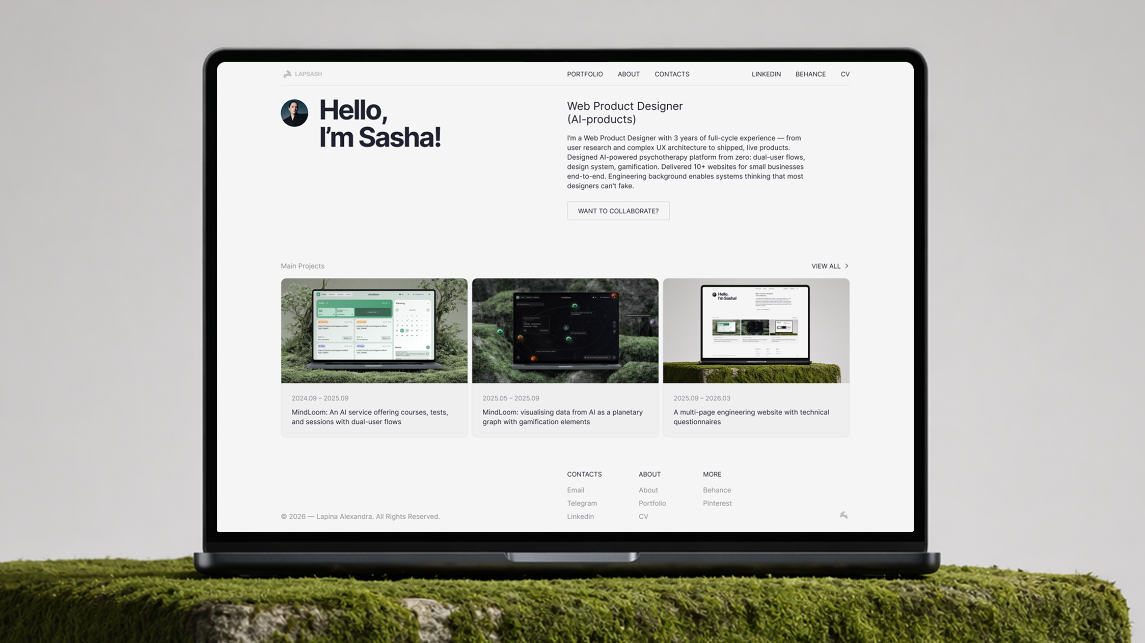
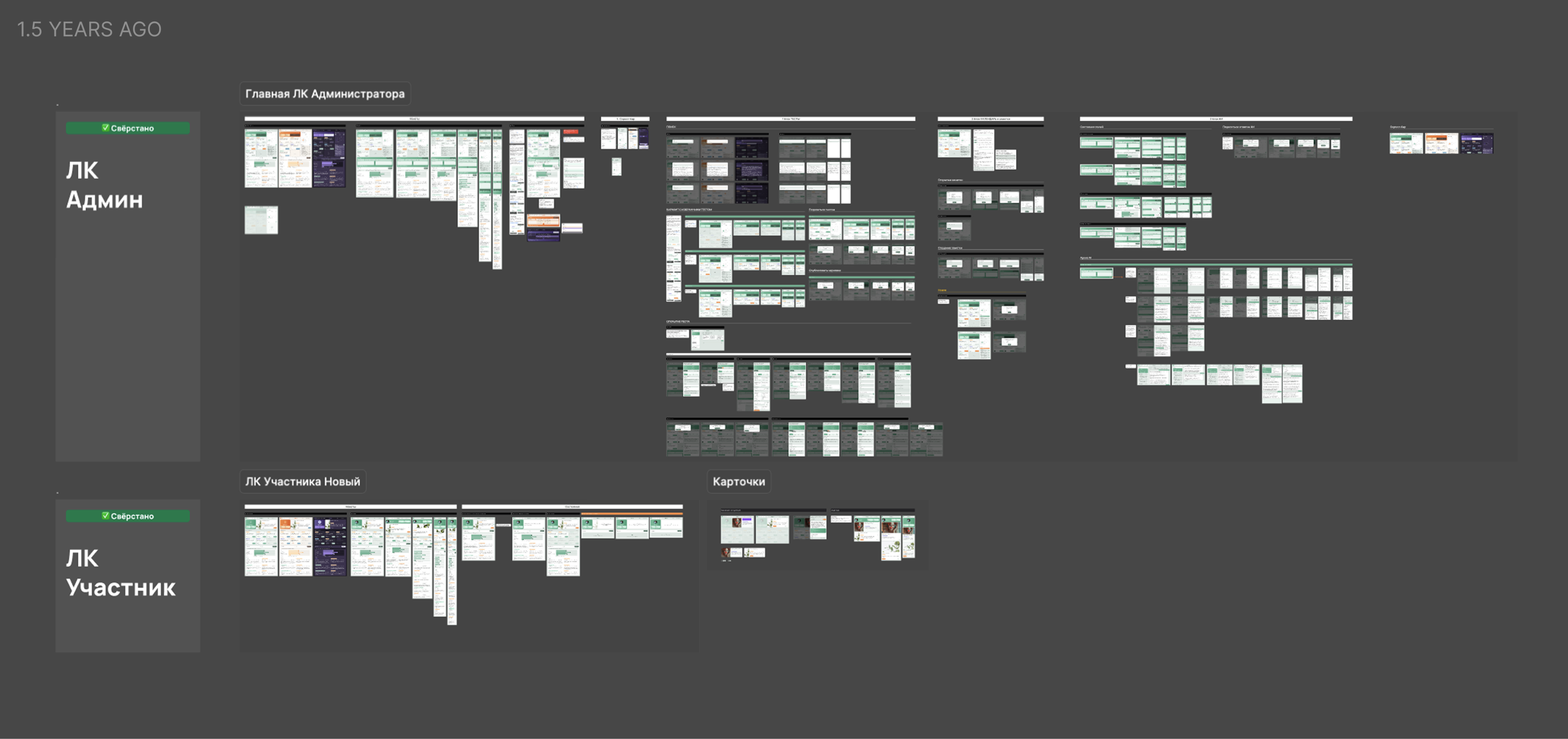
600+layouts
Designed over 15 months, with many brought to life in production.

2024.09 – 2025.09
AI / mental health / dual-user flows / design system
Mindloom: Part 1
Product designer | UX/UI Designer
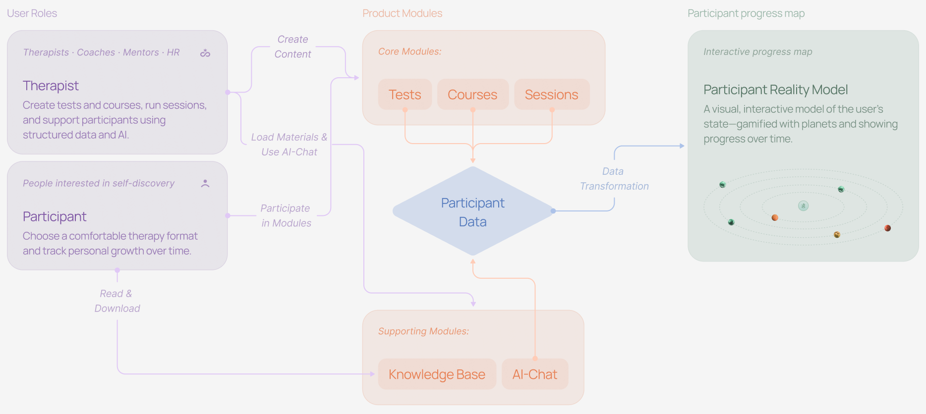
Mindloom is an AI-powered therapy platform where users explore their mental state through tests, courses, and sessions. I worked as the main designer on the project, building the product from scratch — from structure to production-ready interfaces.
Tools
Figma, Notion, ChatGPT, Midjourney
Designed over 15 months, with many brought to life in production.
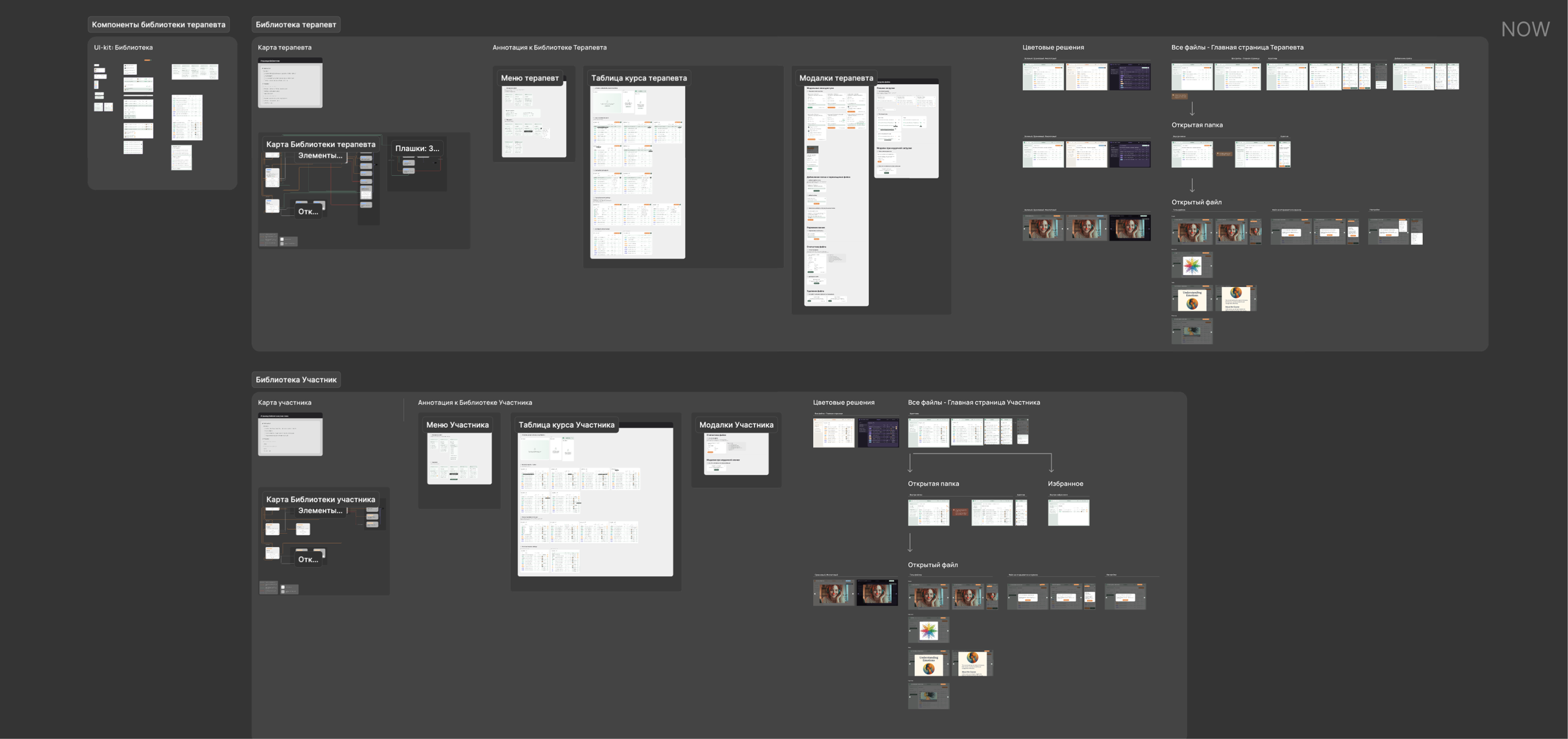
Built a clear structure with tests, courses, sessions, and supporting modules.
Defined participant and therapist roles with distinct interaction logic.
Created end-to-end flows covering key user actions across the product.
Created 3 color schemes with variables for fast and consistent updates.
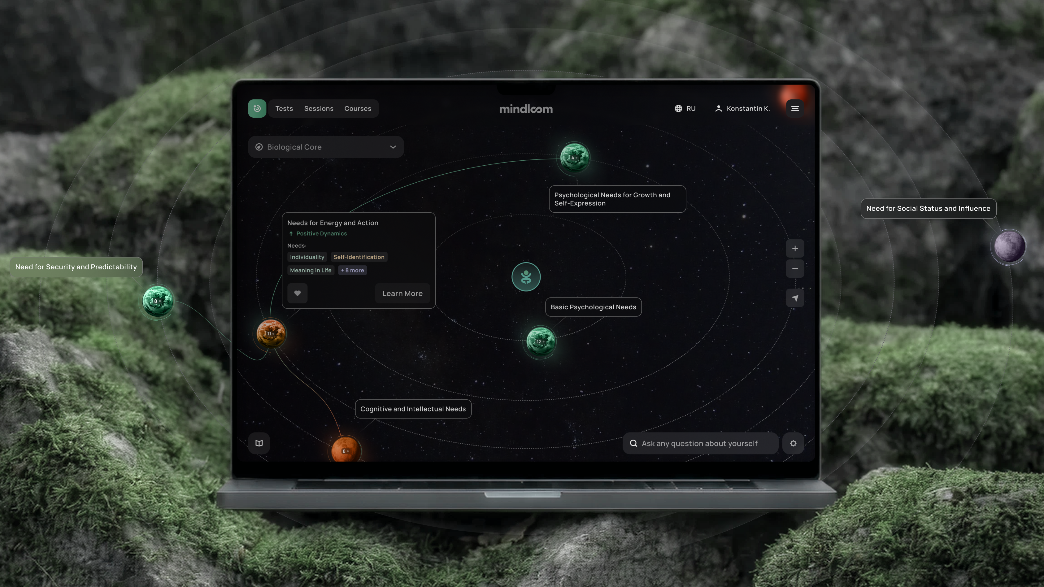
Created a visual system mapping participant data into an interactive state map.
Mindloom is a digital platform that helps users explore their mental state through tests, courses, and sessions with therapists. The product combines structured psychological tools with an AI layer that supports reflection and personal growth.
I worked on the product as the UX/UI product designer at an early-stage startup, collaborating closely with the founder and development team. The project was also supervised by a more experienced Lead designer, with whom we discussed the overall direction and reviewed design concepts and layouts.
From the very beginning, the product was designed for two distinct user roles: therapists and participants. Each role had its own user flow, significantly shaping the overall product experience.
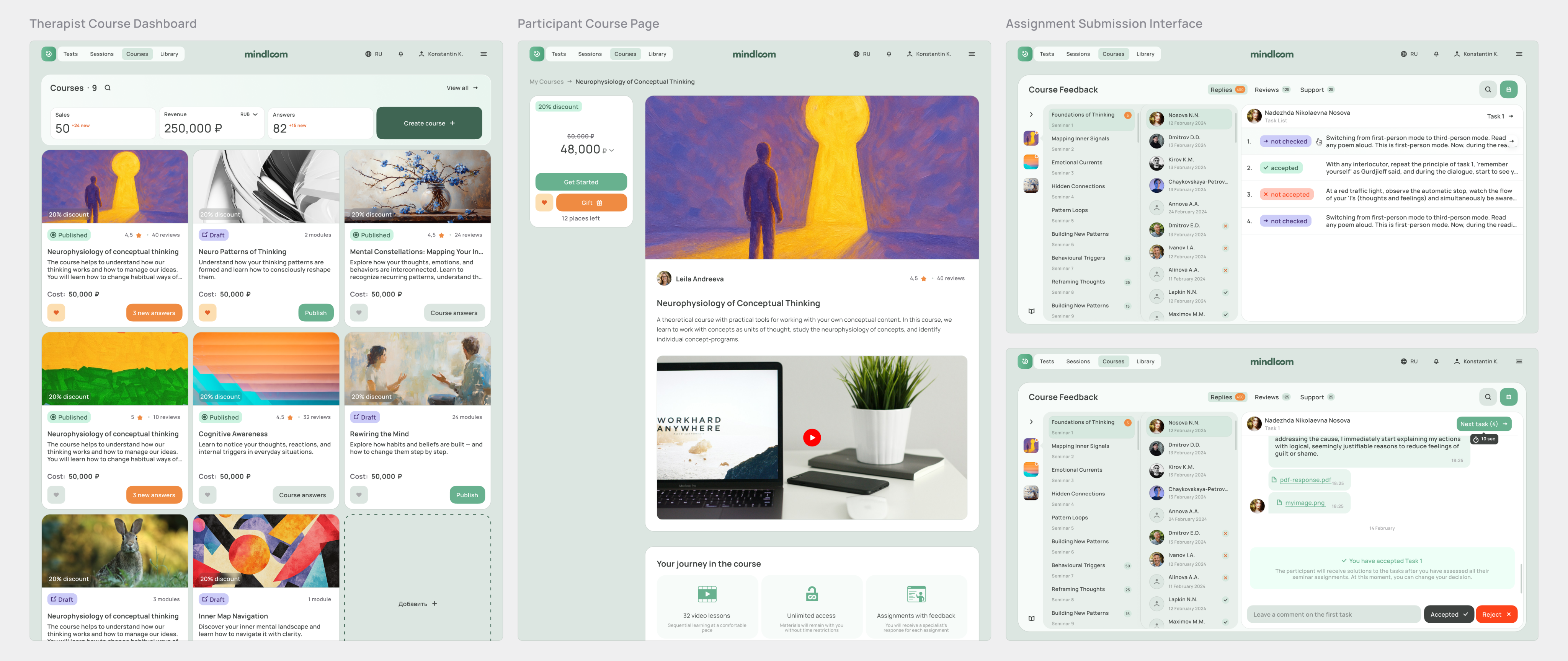
For therapists, the goal was to create a convenient ecosystem for content creation (tests, courses), as well as tools for scheduling sessions and tracking participant progress.
For participants, it was important to build an engaging and friendly environment that encourages regular interaction and long-term use.
The data collected during therapist-participant interactions (with user consent) forms a dynamic model — a visual representation of the participant's mental state.
The project started with test development, followed by layout implementation and parallel testing while I began creating courses. The courses section eventually became my favorite part of the project, as it was both the most challenging and the most interesting due to its complex logic and multiple user flows.
After about six months of developing the core features, I continued working on the sessions section while moving on to designing the client reality model and AI chat, focusing on creating an interactive and meaningful user experience. Overall, the project took around a year.
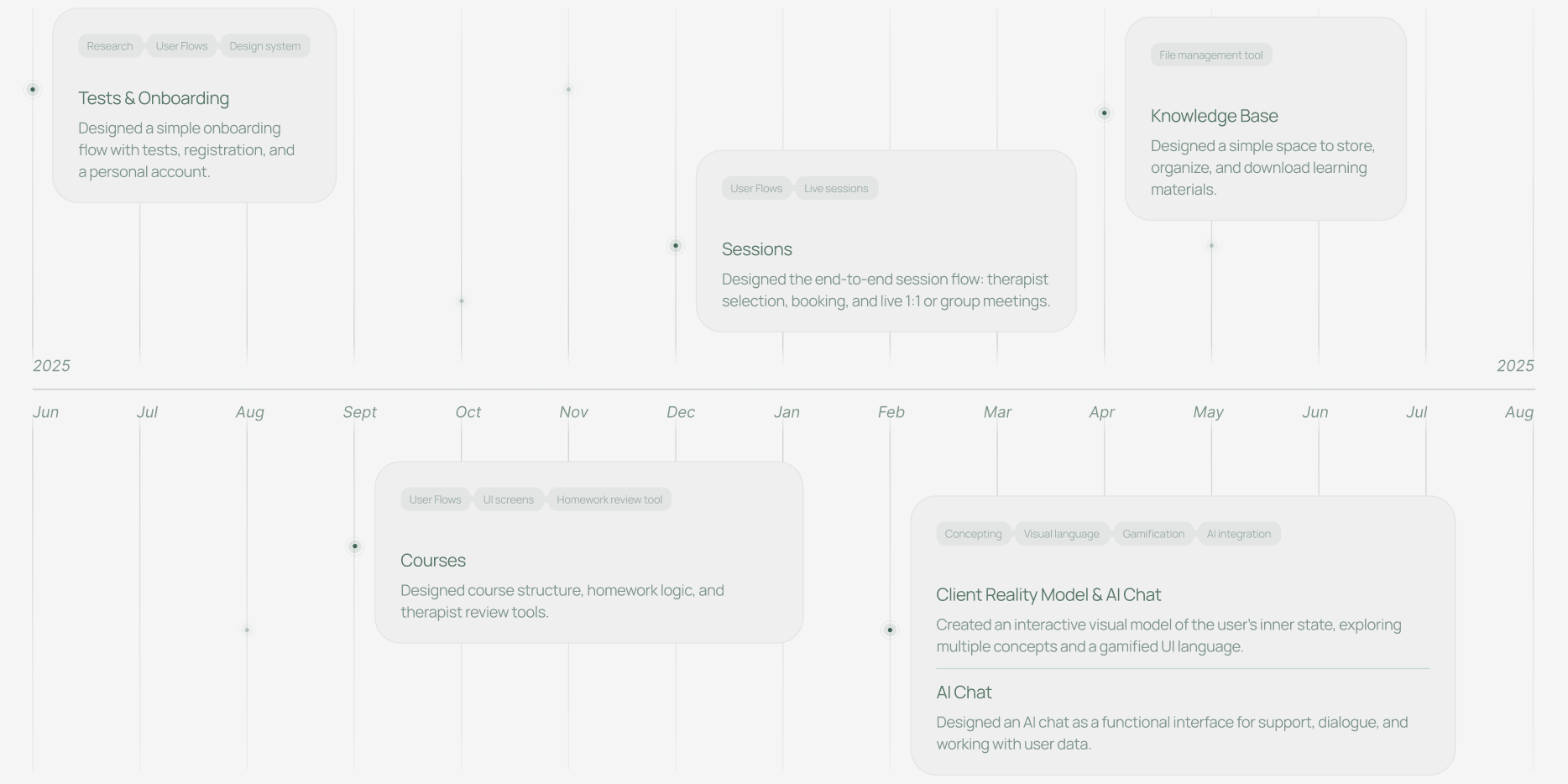
During the discovery phase, I worked closely with my team lead to gather product requirements and client insights. I conducted a competitive analysis and explored references to understand market patterns and best practices.
Before designing each module, I created user flows for both therapists and participants to define core user journeys and system logic.
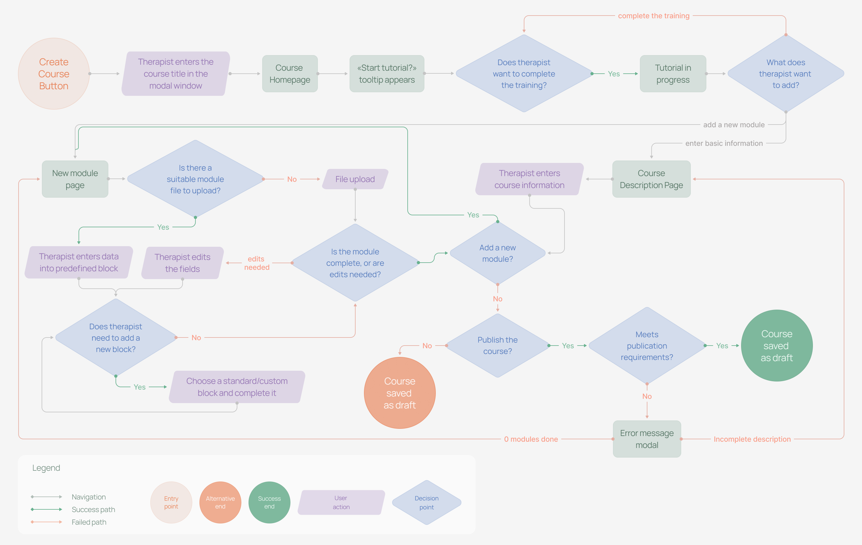
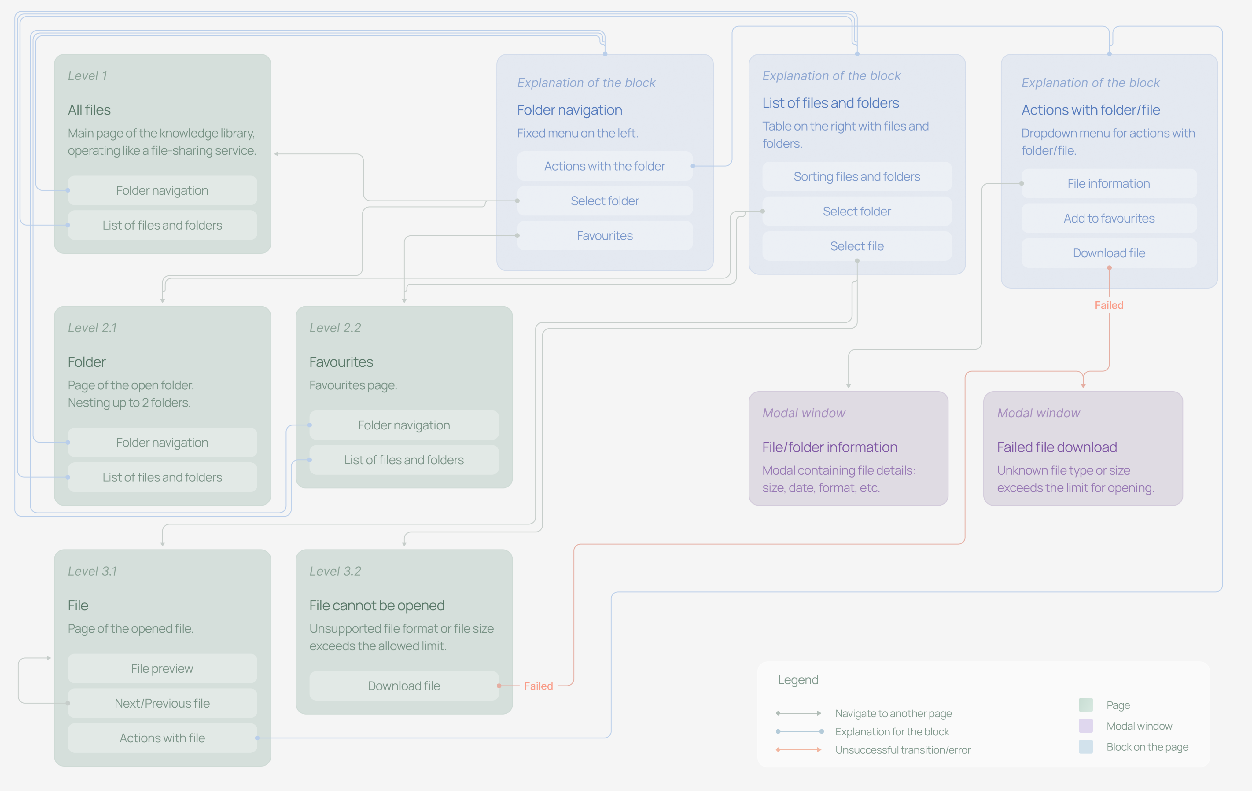
To illustrate my design process, I chose one of the most complex parts of the product — the therapist interface for reviewing homework submitted within a course module.
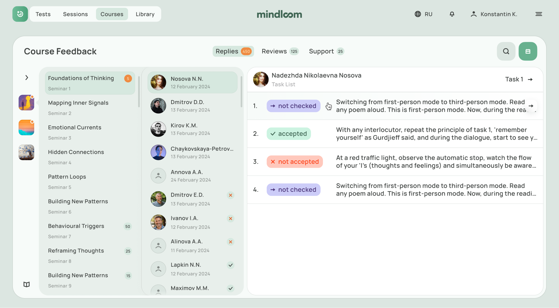
The goal was to design a tool that would allow therapists to review homework assignments submitted within a course module. They needed to either approve or reject submissions and provide feedback in every case.
The main challenges were:
After discussing the logic of this section, we decided that users should be able to see all courses, modules, participants, and the chat in one place, so they could quickly navigate to the task they needed. As a primary reference, we looked at interfaces like Slack, with their complex hierarchy and nested structure.
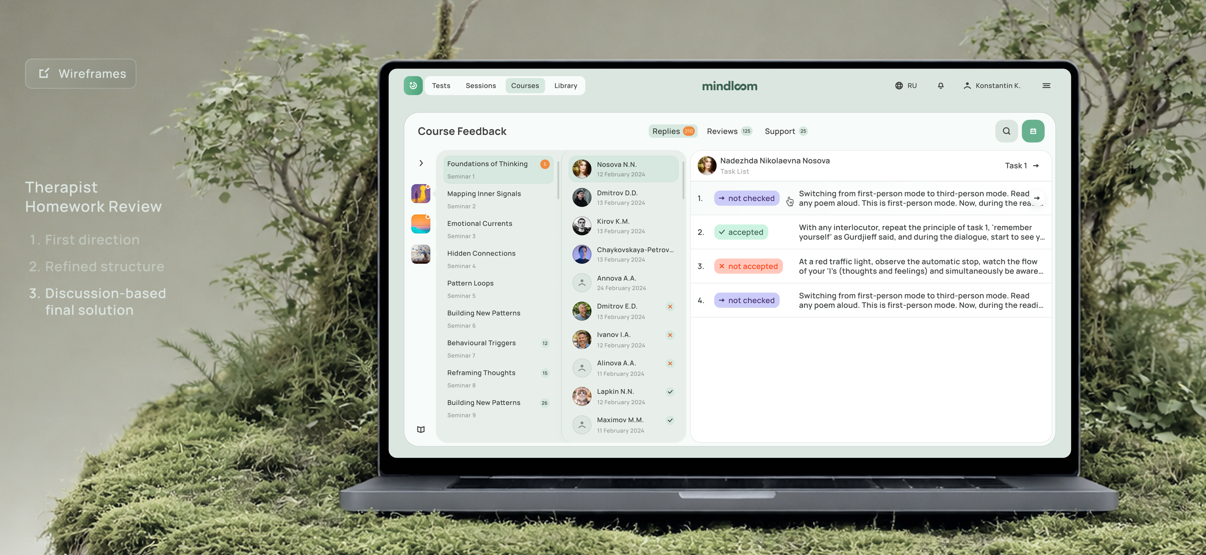
In the first wireframe iteration, we realized that seminars were not separated clearly, and there was no way to choose a specific task directly. This made the homework review process less convenient. That is why we ultimately moved forward with the following version.
Completed before the final handoff to development.
Designed and prepared for development within one month.
All screens were organized into a clear user flow for easier implementation.
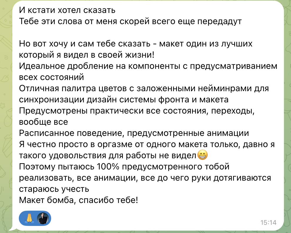
I also want to share a feedback from the developer I worked with on this flow. I translated it as accurately as possible while keeping the original tone :)
“I also wanted to tell you directly — this is one of the best UI files I've seen in my career. The component breakdown is excellent, with previews of all states. The color system is thoughtfully structured, with clear naming that helps keep the design and frontend aligned. Almost every state and transition is covered. Behaviors are documented, animations are considered — basically, everything is there. Honestly, I've rarely seen work that feels this well prepared for implementation. I'll do my best to bring it to life exactly as designed. Amazing work — thank you!!”
Design systems are a core part of my process in every project, and I always try to approach components through the lens of atomic design.
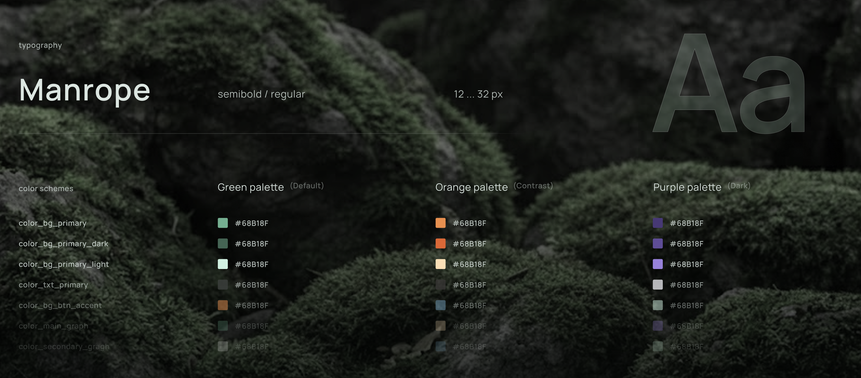
What made this project especially distinctive for me was its color system: I created three separate color themes and organized them into design tokens. In addition, each module had its own subgroup of components — moslty cards, tables, and unique "organism"-level patterns.
In conclusion, I’d like to say that this project became truly meaningful to me. I joined it as a designer without product design experience, and I’m leaving it with a strong foundation of knowledge that now includes creating a wide range of digital products. The list of references and competitors included products such as Coursera, Zoom, Yasno, Slack, Google Drive, and even Notion.
Still, looking back, I can see moments where I would approach things differently now: in some places I would refine the UI more, and in others I would think through the structure more deeply. These shortcomings came from a lack of experience. At the beginning of the project, there were times when I didn’t fully understand how to structure a product properly, but over time I learned how to create guidelines that were clear and practical for developers.
So I understand, that even my guidelines might be as well as convinient as good looking.
I’m grateful to this project for the experience and for the people who surrounded me along the way. And if you’d like to work with me, I’d be happy to discuss the details and get started.
Let’s build something coolOpen to projects
Contact me and we'll turn your idea into a great product.